Project: Visual Identity – Metanoia
Client: Company specialized in blinds cleaning, moving, and general cleaning services.
Year: 2025
THE PROBLEM
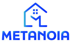
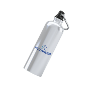
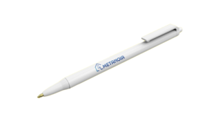
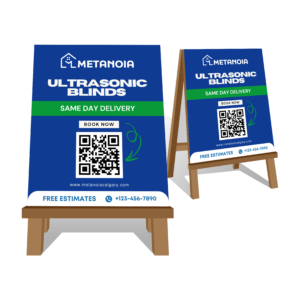
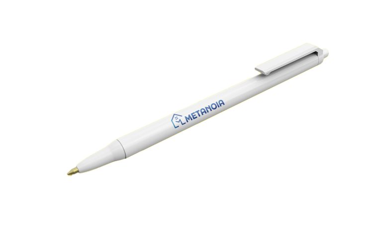
Metanoia was expanding its services and needed a modern visual identity that conveyed trust, organization, and versatility. The name “Metanoia” carries a meaning related to change and renewal, which needed to be reflected in the brand identity. The previous logo contained too many visual elements, making it look cluttered and reducing its readability. When scaled down for small applications—such as pens or promotional items—the logo lost clarity and failed to maintain visual impact.


OBJECTIVE
Create a logo that represents the home (the main setting of their services) while conveying the idea of movement and transformation, aligned with the services offered: cleaning, moving, and maintenance.
CREATIVE PROCESS
- Researched visual references in the cleaning, moving, and home maintenance sectors.
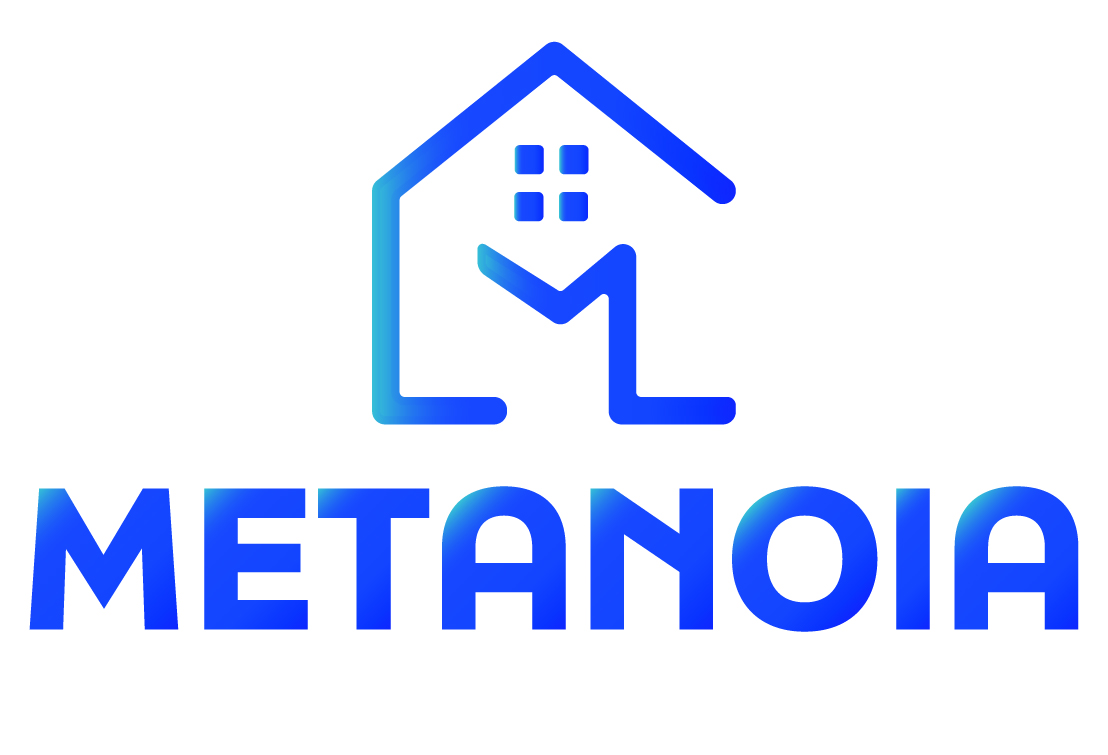
- Worked on concepts of “home” and “change” in a minimalist icon.
- Designed the house outline to incorporate the letter “M,” creating a direct link to the company’s name.
- Chose a blue gradient to convey freshness, cleanliness, and professionalism.
- Used a bold, modern typeface to reinforce the brand’s solidity and trustworthiness.


RESULT
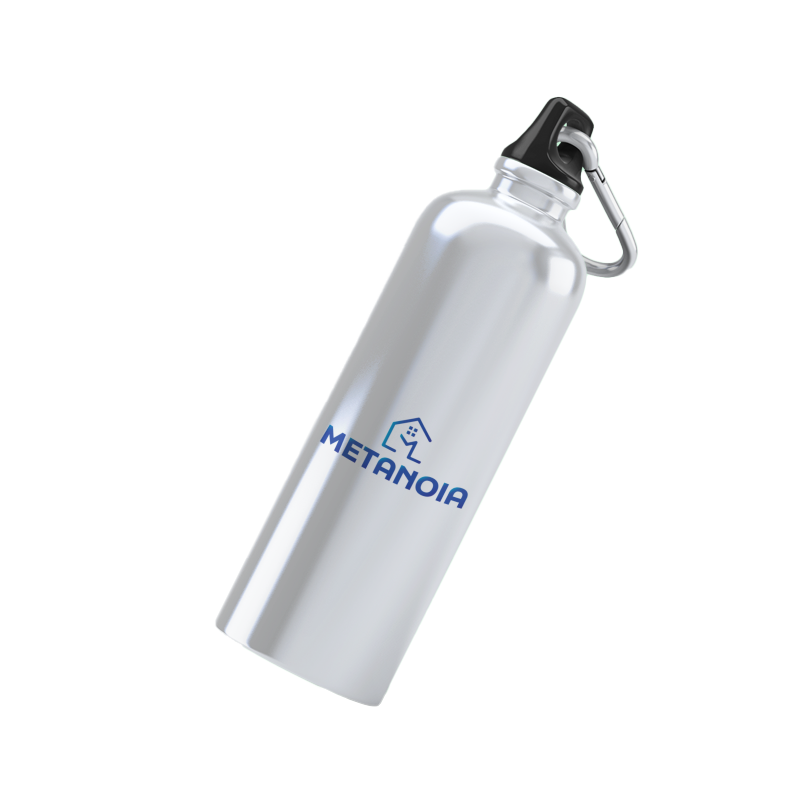
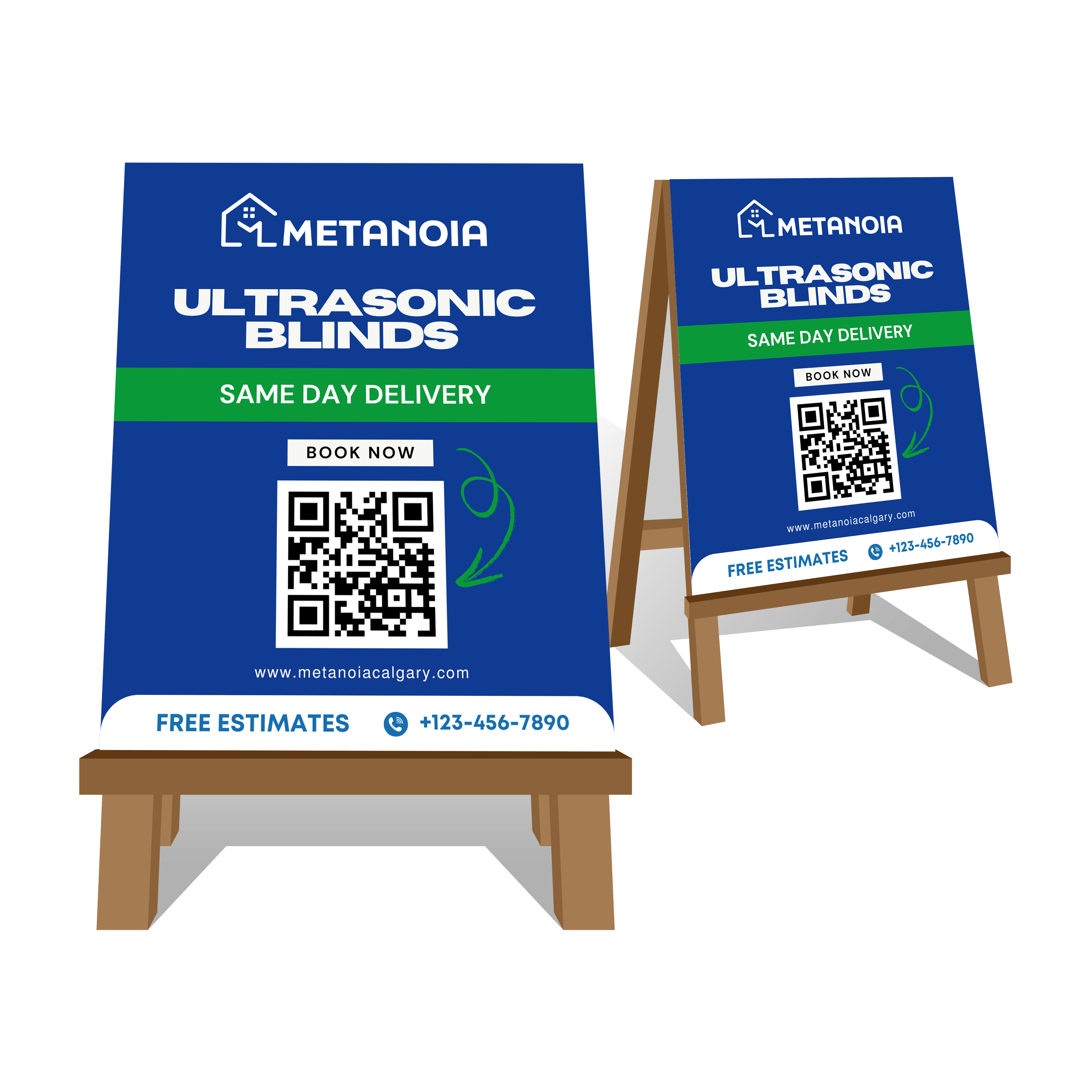
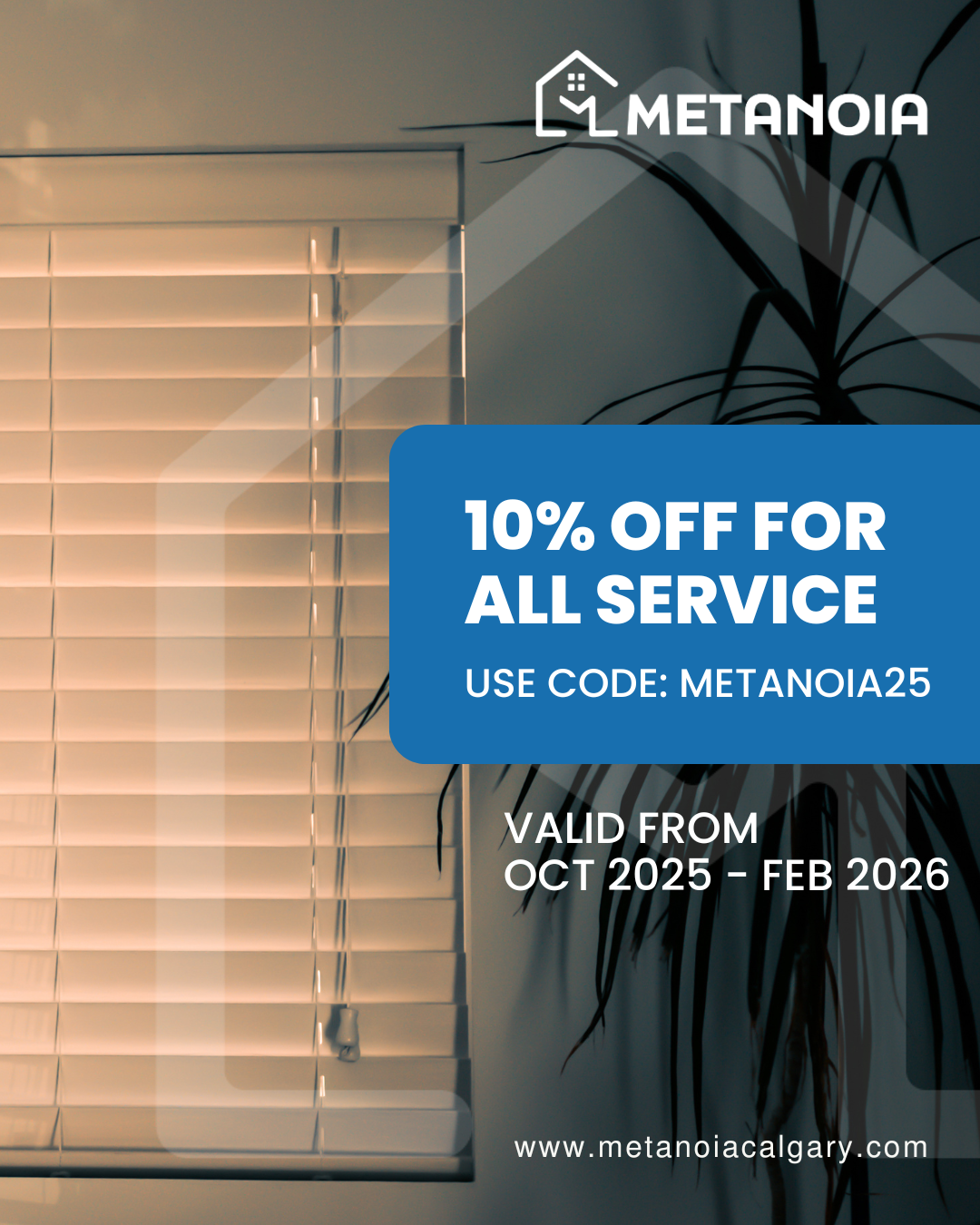
The final logo is versatile and adaptable to different media (uniforms, vehicles, business cards, and social media), maintaining legibility and recognition even at smaller sizes. The brand communicates modernity, clarity, and professionalism, positioning Metanoia as a reference in the services it provides.
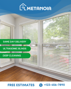
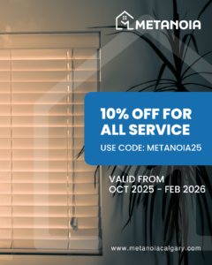
See materials below with the brand application: